
Hrivnák dělá jméno sobě
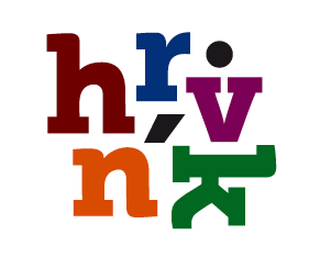
Tomáš Hrivnák si založil novou firmu jménem Hrivnák. Podívejte se, jaké logo si pro sebe vytvořila agentura zaměřená na budování značek.
Značka je sympatická typografická kompozice. Zdá se, že její autor nemá rád samohlásky...
Autor značky Lumír Kajnar nám poslal obrazovou glosu o vývoji loga.tvorba logotypu.pdf
Zdroj: http://hrivnak.blogspot.cz
Komentáře k článku
13. 9. 2012 23:58 Jirka Dvořák
Be cool, Dmitry.
Below my investigation I´ve mentioned, that I like the logo.
I´ve no constructive thought, I think it works good.
Bye, J.
Below my investigation I´ve mentioned, that I like the logo.
I´ve no constructive thought, I think it works good.
Bye, J.
13. 9. 2012 17:44 David Brousek
Co je to hrvnk? Proč ten pán vůbec potřebuje logo? :O
8. 9. 2012 12:07 Intrika
Pokud bych si nepřečetl příjmení, logu samotnému bych nerozuměl a příjmení si z něj neposkládal. Bohužel.
7. 9. 2012 14:35 Dmitry A. Strapchev
@Jirka Dvořák:
Thanks for the promo! You are very insightful.
But do you actually have any constructive thought about the logo?
We are here to discuss the logo and design, isn't it?
Thanks for the promo! You are very insightful.
But do you actually have any constructive thought about the logo?
We are here to discuss the logo and design, isn't it?
7. 9. 2012 11:09 Jirka Dvořák
Dima Strapchev's Overview
Current
Design Consultant at Hrivnak
Graphic Designer at Idealisti
Graphic Designer at dept of Design
:-)
Jinak logo baví...
Current
Design Consultant at Hrivnak
Graphic Designer at Idealisti
Graphic Designer at dept of Design
:-)
Jinak logo baví...
6. 9. 2012 18:20 Dmitry A. Strapchev
It is distinctive, rememberable, recognisable. Works good in small sizes. It directly refers to the company's name. It indirectly refers to modularity, versatility and playfulness. And the logo has a great room for animation ideas.
From aesthetic point of view the overall composition a little bothers my eye, but I think these are details which can be refined as time goes on. Interesting thing is that the letters and diacritics can be reshuffled and the logo will still be recognisable.
Technically I wouldn't worry much about number of colours for print reproduction -- its 2012 now, everything is possible and is relatively cheap for production. More important that this logo works good on screens, and small screens of portables.
I think it has a great potential. I'm looking forward to see the logo in the context of extended visual identity. I think it is a successful start!
6. 9. 2012 02:23 Mňčk
Dobře Spjbl :D
5. 9. 2012 15:42 Honza
Ačkoliv na Museo (v jakékoliv podobě) jsem už alergický a vnímam ho jako Papyrus dneška, to logo nějak pohromadě funguje. Chybí mi hlubší koncept ("vstupní idea" je prostě to logo, nic to nevysvětluje), chybí mi širší vizuální styl který by to nějak rozvíjel a ospravedlňoval. Čitelnost je v případě že neznáme jméno nulová; a připsat jméno k logu by byla zase velmi nečistá duplikace: do budoucna myslím docela slušně nepříjemná věc. Barevný je to až moc - tisk 6 přímých barev, dost neekonomické a zdaleka ne každý ofset to umí, ve CMYKu daleko od dokonalosti, v černobílé to ztrácí jednu ze svých nejvýraznějších vlastností. Objektivně a technicky tedy docela dost Ale. Přesto mě to celkem neuráží. Má to alespoň náznak osobitosti. Mnohem větší starost mi dělá to, jaká je z diskuze na Fontu poslední dobou žumpa; prezentovat tu cokoliv začíná být za trest (nebo minimálně k nulovému užitku).
5. 9. 2012 13:37 David Ledl
Dobře Spjbl :D
4. 9. 2012 22:28 Spjbl
HuRVíNeK.
4. 9. 2012 20:14 Scoty
Vizitka agentur u nás..
4. 9. 2012 12:53 Font
Přidali jsme vývoj této značky. Podívejte se.
4. 9. 2012 10:33 Nobody
Chápu, co dělá tento post na stránkách font.cz
3. 9. 2012 09:39 Cucflek
Kdo to je Hrivnák?
2. 9. 2012 20:17 František Polák [www.fpolak.eu]
Sympatický leda tak jako chlupatá řiť.
2. 9. 2012 19:18 Tomáš Hrivnák
:)
1. 9. 2012 10:57 Patrik Holešovský
Nechápu, co dělá tento post na stránkách font.cz
31. 8. 2012 23:59 Richard S.
Hezký a kupodivu čitelný. Pěkná práce!
31. 8. 2012 17:17 Přemysl Bukovský
Patrně půjde o hebrejštinu :)